Fonz
Premium Member
 Registered: 12th May 06
Location: Newbury, Berks
User status: Offline
|
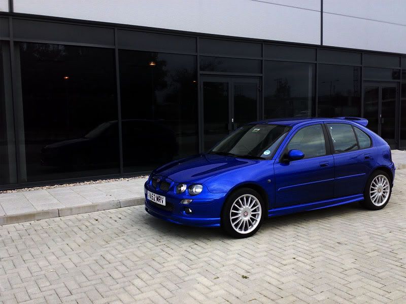
1) original

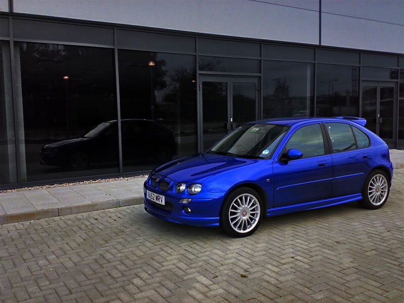
'shopped

really would like to make this one look like the car was moving but couldnt work out how to get the wheels to look like they were spinning 
2)

3) original

'shopped


4) original

'shopped

5) original

'shopped


6) original

'shopped


7)


comments welcomed, if anyone has tips or can help me out with number 1 i would be most grateful 
edit: sorry for mis match in sizes, some taken from Facebook, others from photobucket (-mainly the originals as i didnt upload them to FB!)
[Edited on 20-10-2008 by Fonz]
|
liamC
Member
Registered: 28th Feb 04
User status: Offline
|
radial blur for your car to look like it's moving
though its probably best to have someone sitting in it if you want to achieve it.

[Edited on 20-10-2008 by liamC]
|
John
Member
Registered: 30th Jun 03
User status: Offline
|
Apart from number 6 which looks quite good, all the sjops look worse than the original. Dark and grainy in most cases,
|
liamC
Member
Registered: 28th Feb 04
User status: Offline
|
quote:
Originally posted by John
Apart from number 6 which looks quite good, all the sjops look worse than the original. Dark and grainy in most cases,
I thought this also 
|
deano87
Member
Registered: 21st Oct 06
Location: Bedfordshire Drives: Ford Fiesta
User status: Offline
|
Not sure what you were trying to achieve with the photoshops, and I'm no expert, but the car looks good 
|
AdZ9
Member
Registered: 14th Apr 06
User status: Offline
|
I thought this thread was a piss take half way through looking at the pics, only because the photoshops are worse than the original pics lol :/
Sorry mate but i think its back to the drawing board, what type of effect/style were you aiming towards? Might be able to help or point towards a good tutorial site etc
|
Ben G
Member
Registered: 12th Jan 07
Location: Essex
User status: Offline
|
quote:
Originally posted by liamC
quote:
Originally posted by John
Apart from number 6 which looks quite good, all the sjops look worse than the original. Dark and grainy in most cases,
I thought this also 
same, look shit 
|
Calum
Member
Registered: 2nd Sep 06
Location: Edinburgh, City of Edinburgh
User status: Offline
|
Try subtly adjusting the levels, contrast and exposure of the origionals to give them more debth and sort out any over exposed areas from the camera.
Its much easier to use higher resolution pictures too.
Usually you won't want to be too harsh with the adjustments, with maybe an increase of 5 for the contrast and subtle adjustment of the levels.
Do a google search for 'how to make a picture look more professional'
|
Fonz
Premium Member
 Registered: 12th May 06
Location: Newbury, Berks
User status: Offline
|
quote:
Originally posted by John
Dark and grainy in most cases,
grainy = 3.2 Nokia phone camera 
dark = was trying to achieve a better representation of the "vivid" blue colour of the car, adjusting the contrast both ways i felt the darker options offered more. i like them even if they are not welcomed, feel free to show me how its supposed to be done!
(nb - my "photoshop" is a much more basic attempt at photo edditing and not photoshop as Adobe know it 
|
DannyB
Premium Member
 Registered: 6th Feb 08
User status: Offline
|
Use hi-res pics to PS, anythin else doesnt come out right usually.
|
John
Member
Registered: 30th Jun 03
User status: Offline
|
Very very very quick and basic PS, i'm not any good at photoshop, basic levels and saturation to make the colour pop a bit.

As Danny says, low res pics aren't very good for it.

[Edited on 20-10-2008 by John]
|
Calum
Member
Registered: 2nd Sep 06
Location: Edinburgh, City of Edinburgh
User status: Offline
|
You can also try enhancing one colour, or bringing out detail lost from exposure (using shadow/highlight)
Not saying this is how they should look, just ideas


|
deano87
Member
Registered: 21st Oct 06
Location: Bedfordshire Drives: Ford Fiesta
User status: Offline
|
quote:
Originally posted by complex_maze
You can also try enhancing one colour, or bringing out detail lost from exposure (using shadow/highlight)
Not saying this is how they should look, just ideas


|
mattk
Member
Registered: 27th Feb 06
Location: St. Helens
User status: Offline
|
Original

My Attempt

|


