Matt L
Member
Registered: 17th Apr 06
User status: Offline
|
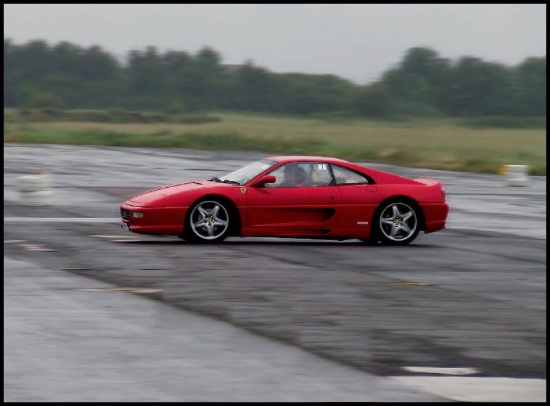
its quite weird to think how easy it is to make an image look completely different (imo).
i mean the original i like but compared to the shop it looks dull and boring 

and the photoshopped

C+C welcomed as always
ps if anyone could tell me how to get rid of the cones+building without it looking sh*t  (iv tried the clone stamp tool but looks really bad. (iv tried the clone stamp tool but looks really bad.
[Edited on 26-06-2008 by Matt L]
|
Tommy L
Member
Registered: 21st Aug 06
Location: Northampton Drives: Audi wagon
User status: Offline
|
damn, was going to say the clone tool 
|
Butler
Member
Registered: 2nd Jun 05
Location: London
User status: Offline
|
When you are shooting cars try a slower shutter and panning, adds alot more action. To remove the cones try copying a section of tarmac from between them and pasting it ontop and blending it in? Thats what id try anyway.
|
d4za
Member
Registered: 18th Oct 06
Location: Bloxwich, West Midlands
User status: Offline
|
Hope you dont mind but I was bored so I had a play with your pic........

|
Matt L
Member
Registered: 17th Apr 06
User status: Offline
|
cheers hicko 
butler i wanted a slower shutter speed but my iso was as low as possible, same with the apature but the shutter speed was still quick for what i wanted but if i went any slower they'd be all over exposed  . thought id left my poloriser lense at home (would of made it darker so the shutter could of been slower) . thought id left my poloriser lense at home (would of made it darker so the shutter could of been slower)
|
Scotty_B
Member
Registered: 11th Jun 03
Location: East Kilbride
User status: Offline
|
Matt try a letter box crop. 
|
Matt L
Member
Registered: 17th Apr 06
User status: Offline
|
what you mean? just crop it so its smaller height wise?
|
Scotty_B
Member
Registered: 11th Jun 03
Location: East Kilbride
User status: Offline
|
quote:
Originally posted by Matt L
what you mean? just crop it so its smaller height wise?
If you don't mind could you send me the Hi-Res original to play with if you can. 
to: beatsri@hotmail.com

|
Matt L
Member
Registered: 17th Apr 06
User status: Offline
|
added on msn mate 
|


