Jamie-C
Member
Registered: 3rd Jun 08
Location: Ballycastle
User status: Offline
|
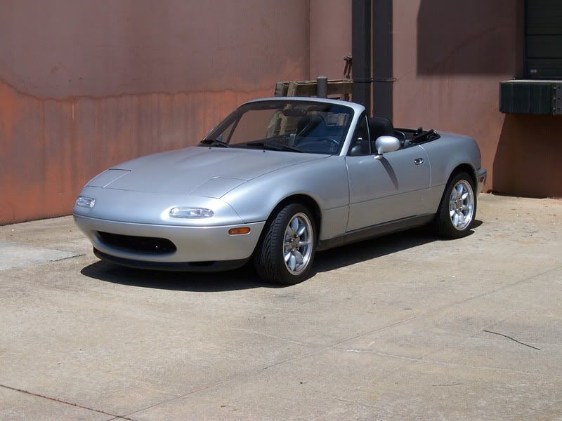
Done another chop this week for a photoshop challenge 
Before

After

C&C please 
[Edited on 18-04-2011 by Jamie-C]
|
Phillips_91
Member
Registered: 20th Jan 10
Location: Blackpool. Drives: Sapphire Black Mk4 Astra 1.8
User status: Offline
|
Should of left front number plate of and the holes in front bumper 
|
Tom G
Member
Registered: 4th Aug 08
Location: Cheshire
User status: Offline
|
thats terrible
|
Scotty_B
Member
Registered: 11th Jun 03
Location: East Kilbride
User status: Offline
|
quote:
Originally posted by Tom G
thats terrible
 Harsh Harsh
It's not to bad.
|
BluKoo
Member
Registered: 8th Apr 02
Location: Stonehaven (Scotland)
User status: Offline
|
It is pretty rough.
The black circles on the front have no perspective or depth. Plus they're off centre. If you were to view that car straight on, they'd be too far over to the right.
The colour change to white doesn't work as its looks like its just been totally desaturated. White will almost always have a hint of yellow/blue/green in it.
The wheels are the wrong hue, or they're too bright. Whatever it is, they stand out too much.
To be honest though, its the selections that let it down the most though. They're really rough and jaggy.
[Edited on 21-04-2011 by BluKoo]
|
Jamie-C
Member
Registered: 3rd Jun 08
Location: Ballycastle
User status: Offline
|
In other words its shit  , the holes in the bumper was an after thought I had already closed photoshop then thought about it, opened it up again, got the brush tool and done some dots so that was always going to fail , the holes in the bumper was an after thought I had already closed photoshop then thought about it, opened it up again, got the brush tool and done some dots so that was always going to fail 
I noticed my selections were jaggy, I'm not sure why as it never used to happen, I've tried tweaking the settings but they are still turning out jaggy 
|
Tom G
Member
Registered: 4th Aug 08
Location: Cheshire
User status: Offline
|
It looks like its not merging your cut bits.
|


