A2H GO
Member
Registered: 14th Sep 04
Location: Stoke
User status: Offline
|
Google Now out for iOS.
Also from 9to5mac...
"According to multiple people who have either seen or have been briefed on the upcoming iOS 7, the operating system sports a redesigned user-interface that will be attractive to new iOS users, but potentially unsettling for those who are long-accustomed to the platform…"
"The new interface is said to be “very, very flat,” according to one source. Another person said that the interface loses all signs of gloss, shine, and skeumorphism seen across current and past versions of iOS. Another source framed the new OS as having a level of “flatness” approaching recent releases of Microsoft’s Windows Phone “Metro” UI."
|
Rob_Quads
Member
Registered: 29th Mar 01
Location: southampton
User status: Offline
|
Sounds like Ive is making some major changes in his new role.
The problem they have is no matter what they do people will moan. If they don't do anything people say its boring, never changes, if they change it, it will get criticized for being like X or Y (as there is not a lot you can do now to be honest.
|
A2H GO
Member
Registered: 14th Sep 04
Location: Stoke
User status: Offline
|
If a refresh is true everyone will hate it then a few months later the same people will say it's the most beautiful OS ever made.
|
mwg
Member
Registered: 19th Feb 04
Location: South Lakes
User status: Offline
|
Then you'll make it look like something completely different
|
Nath
Member
Registered: 3rd Apr 02
Location: MK
User status: Offline
|
quote:
Originally posted by A2H GO
If a refresh is true everyone will hate it then a few months later the same people will say it's the most beautiful OS ever made.
Yeah I reckon you will.
|
Nath
Member
Registered: 3rd Apr 02
Location: MK
User status: Offline
|
quote:
Originally posted by mwg
Then you'll make it look like something completely different
 Best phone and iOS ever made. But let me just tweak this, jailbreak that, download this, make it look like an Android, and bingo, perfect. Best phone and iOS ever made. But let me just tweak this, jailbreak that, download this, make it look like an Android, and bingo, perfect.
|
A2H GO
Member
Registered: 14th Sep 04
Location: Stoke
User status: Offline
|
Some baiting going on in here 
|
Dom
Member
Registered: 13th Sep 03
User status: Offline
|
quote:
Originally posted by Nath
quote:
Originally posted by A2H GO
If a refresh is true everyone will hate it then a few months later the same people will say it's the most beautiful OS ever made.
Yeah I reckon you will.
Wireless charging 
|
Nath
Member
Registered: 3rd Apr 02
Location: MK
User status: Offline
|
quote:
Originally posted by A2H GO
Some baiting going on in here 

|
A2H GO
Member
Registered: 14th Sep 04
Location: Stoke
User status: Offline
|
Lost me on that one Dom 
|
Dom
Member
Registered: 13th Sep 03
User status: Offline
|
quote:
Originally posted by A2H GO
Lost me on that one Dom 
Doesn't surprise me 
|
A2H GO
Member
Registered: 14th Sep 04
Location: Stoke
User status: Offline
|
Failed trolling 
[Edited on 30-04-2013 by A2H GO]
|
Dom
Member
Registered: 13th Sep 03
User status: Offline
|
Wasn't baiting or trolling, i just think you're a cunt 
|
Rob_Quads
Member
Registered: 29th Mar 01
Location: southampton
User status: Offline
|
Hold the press. Apple (and others) are on the wrong ball game here...
CEO of Blackberry ....
"In five years, I see BlackBerry to be the absolute leader in mobile computing -- that's what we're aiming for"
""In five years I don't think there'll be a reason to have a tablet anymore"
lol - What he really means is we really screwed up the release of a tablet so we have given up with that one...we have also screwed up with mobile so we are trying to dig ourselves out of this hole before we go bust
|
LeeM
Member
Registered: 26th Sep 05
Location: Liverpool
User status: Offline
|
i dont get what people mean by "flat" ios isnt really 3d? is flat a design term?
|
Dom
Member
Registered: 13th Sep 03
User status: Offline
|
quote:
Originally posted by LeeM
i dont get what people mean by "flat" ios isnt really 3d? is flat a design term?
'Flat-design' is essentially the metro ui ie: minimal - less gradients, radius/corners and shadows (/reflections), more solid colours and squared/straight-lines.
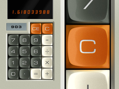
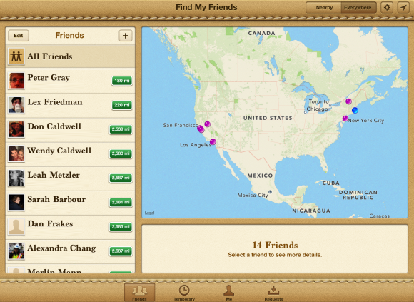
Where as iOS (Android/OS10 and others to some extent) is, currently, 'realistic' design also incorrectly referred to as skeuomorphic design - essentially textured ui, shadows/reflections etc etc.
Worth a read - http://sachagreif.com/flat-pixels/
Edit - Good example of 'skeuomorphism' (Left) to flat-design (Right), with Google's 'half-way house' ui (middle) -

P.s - No doubt Balling can explain it better 
[Edited on 30-04-2013 by Dom]
|
John
Member
Registered: 30th Jun 03
User status: Offline
|
Apple looks old fashioned beside the other 2. Windows phone actually looks the most modern from those particular images.
|
A2H GO
Member
Registered: 14th Sep 04
Location: Stoke
User status: Offline
|
quote:
Originally posted by Dom
Wasn't baiting or trolling, i just think you're a cunt 
Clearly were. 
Feelings mutual. 
|
Balling
Premium Member
 Registered: 7th Apr 04
Location: Denmark
User status: Offline
|
quote:
Originally posted by Dom
P.s - No doubt Balling can explain it better
Not much to add really.
The "flat" term draws from the fact that designers for years have strived to create a sense of depth in a user interface. The current trend heads in the opposite direction.
I don't think the shapes you mentioned can be attributed to a design being flat or not. In my mind a flat design can quite easily accomodate complex shapes, they'll just apear, as you said, as solid objects with no sense of depth (shadows, bevels, reflections etc).
It's worth noting that, to my knowledge, the whole trend started with the touch screen Zune that used mostly plain white text on a solid black backdrop to create it's interface. This was later inherited by Windows Phone and then Windows itself.
  
|
Balling
Premium Member
 Registered: 7th Apr 04
Location: Denmark
User status: Offline
|
quote:
Originally posted by John
Apple looks old fashioned beside the other 2. Windows phone actually looks the most modern from those particular images.
Agree. Windows Phone looks beautiful.
Google are doing a great job of the UI in their iOS apps as well.
  
|
LeeM
Member
Registered: 26th Sep 05
Location: Liverpool
User status: Offline
|
oh i see, i think the windows looks shit personally.
doubt i'll be on os7 anyway, my 4 is slow as shit now so if its even supported i'll bet 7 kills it
|
Balling
Premium Member
 Registered: 7th Apr 04
Location: Denmark
User status: Offline
|
3GS has iOS 6 so I'd expect the 4 to get iOS 7.
If not, I might finally have a proper reason to upgrade.
  
|
A2H GO
Member
Registered: 14th Sep 04
Location: Stoke
User status: Offline
|
Examples of Flat and Skeuomorphic design...
http://dribbble.com/search?q=flat
http://dribbble.com/search?q=skeuomorphism
|
A2H GO
Member
Registered: 14th Sep 04
Location: Stoke
User status: Offline
|
quote:
Originally posted by LeeM
I think the windows looks shit personally.
Ageed.
I like Google's design trend, Google Now looks incredible.
|
Dom
Member
Registered: 13th Sep 03
User status: Offline
|
quote:
Originally posted by A2H GO
http://dribbble.com/search?q=skeuomorphism
Shows a load of examples of people incorrectly defining something as being skeuomorphic when it actually isn't...
Skeuomorphic -

Not Skeuomorphic -

Edit - Always think the OS X Address Book is the worst example of it, as it appears to a skeuomorphic design but lacks the functionality to back that up.
[Edited on 30-04-2013 by Dom]
|


